Are you ready to unlock the full potential of your photos? Dive into the world of photo color correction and discover how this essential editing technique can transform your images from bland to breathtaking. In this guide, we’ll walk you through the basics of color correction, share common techniques, offer advanced tips, and highlight common mistakes to avoid. Let’s get started on your journey to mastering the art of photo color correction!
Understanding the Basics of Color Correction
- The Fundamentals of Color Theory: Color correction is all about understanding the principles of color theory and applying them to your photos. From the warm glow of sunlight to the cool tones of a moonlit night, colors play a crucial role in setting the mood and atmosphere of an image.
- Key Terms and Concepts: To get started with color correction, it’s essential to familiarize yourself with key terms such as white balance, hue, saturation, and contrast. These terms will form the foundation of your editing process and help you achieve accurate and visually appealing results.
- Color Correction Tools: Popular editing software like Adobe Photoshop and Lightroom offer a range of powerful tools for color correction. From simple sliders to advanced adjustment layers, these tools allow you to fine-tune every aspect of your photo’s color palette with precision and control.
Common Color Correction Techniques
- Correcting White Balance: One of the first steps in color correction is ensuring accurate white balance. Adjusting the white balance settings helps neutralize any unwanted color casts and ensures that whites appear truly white in your photos.
- Adjusting Exposure and Contrast: Proper exposure and contrast are essential for achieving clarity and depth in your photos. By fine-tuning these settings, you can enhance the overall brightness and tonal range of your images, bringing out details in both shadows and highlights.
- Enhancing Vibrancy and Saturation: Adding a pop of color can make your photos come alive! Vibrancy and saturation adjustments allow you to boost the intensity of colors in your images, creating more vibrant and eye-catching visuals.
- Reducing Noise and Color Casts: Noise and color casts can detract from the quality of your photos, especially in low-light or high-ISO situations. By reducing noise and eliminating unwanted color casts, you can achieve cleaner and more natural-looking images.
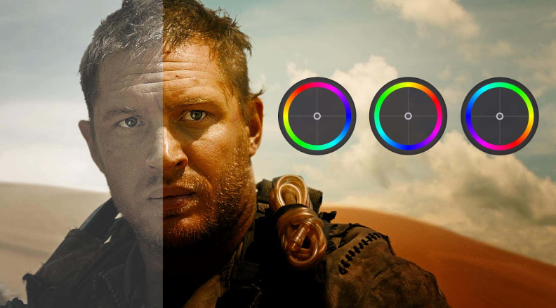
- Creating Specific Moods with Color Grading: Color grading is where the magic happens! This advanced technique allows you to manipulate colors to create specific moods and atmospheres in your photos. Whether you’re going for a warm and cozy feel or a cool and moody vibe, color grading gives you the creative freedom to tell your story.
Advanced Color Correction Tips
- Selective Color Correction: Sometimes, you only want to adjust specific colors in your image while leaving others untouched. Selective color correction techniques allow you to target individual colors and make targeted adjustments for more precise control.
- Curves Adjustments: Curves adjustments offer unparalleled flexibility in fine-tuning the tonal range and color balance of your photos. By manipulating the curves directly, you can achieve custom looks and subtle color adjustments with ease.
- Non-Destructive Editing Practices: Non-destructive editing practices ensure that your original photo remains intact, allowing you to experiment and make changes without fear of losing important data. Techniques like adjustment layers and smart objects provide flexibility and control throughout the editing process.
- Achieving Consistent Color Styles: Consistency is key when it comes to color correction! By developing a consistent editing style and applying it across your entire photo library, you can create a cohesive look and feel that strengthens your brand identity and visual storytelling.
Common Mistakes to Avoid
- Over-Saturation: While vibrant colors can enhance the visual impact of your photos, over-saturation can lead to unnatural-looking results. Avoid the temptation to crank up the saturation slider too high and strive for a balanced and realistic color palette.
- Unrealistic Skin Tones: When editing portraits, it’s crucial to maintain natural-looking skin tones. Be mindful of any color shifts or inconsistencies that may arise during the editing process, and strive to achieve a flattering and lifelike appearance.
- Color Inconsistencies: Inconsistencies in color can detract from the overall harmony and cohesiveness of your photos. Pay attention to how colors interact with each other across different elements of your image, and aim for a harmonious and balanced color palette.
Conclusion
Congratulations – you’ve made it to the end of our guide to mastering the art of photo color correction! By understanding the basics of color theory, mastering common techniques, and avoiding common mistakes, you’re well on your way to becoming a color correction wizard.
Remember, practice makes perfect! Don’t be afraid to experiment with different editing techniques and develop your own unique style. And if you ever find yourself in need of professional photo editing services, bZm Graphics is here to help. With their expertise and attention to detail, you can trust that your photos will always look their best.